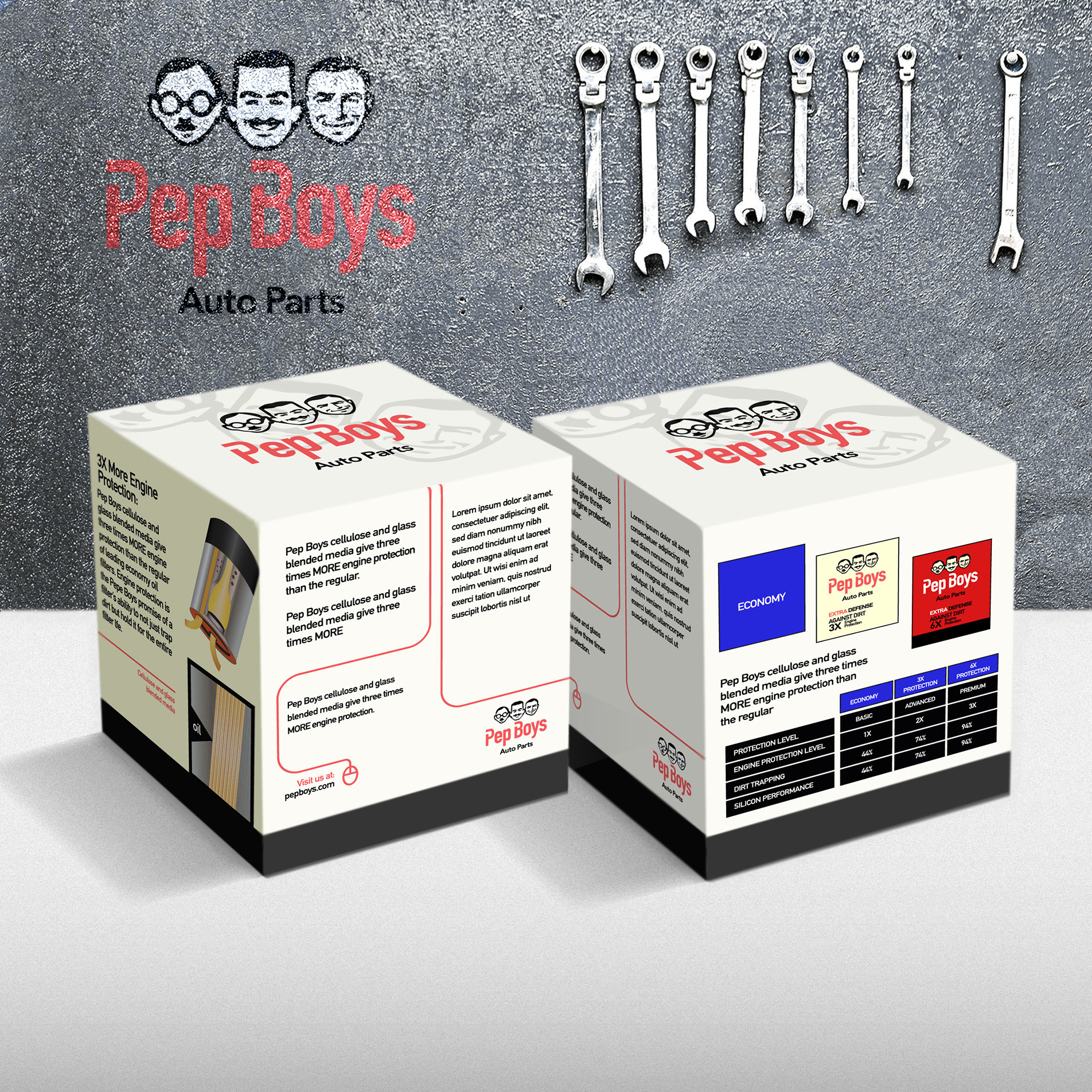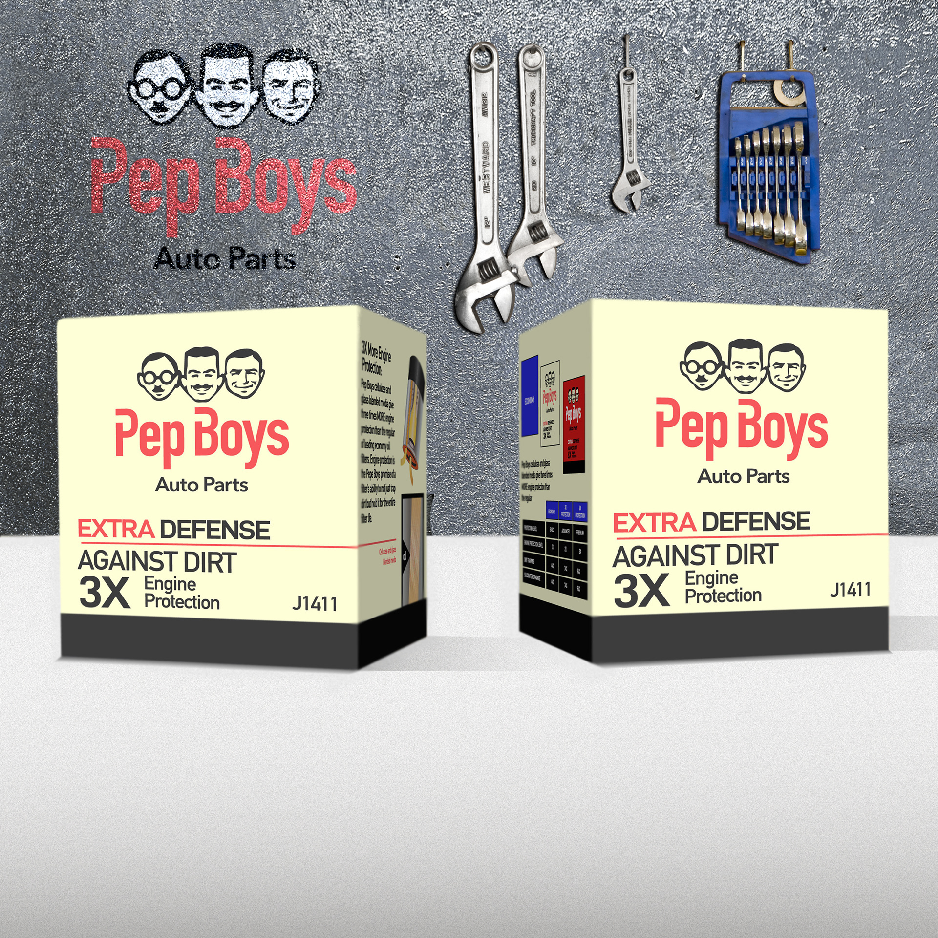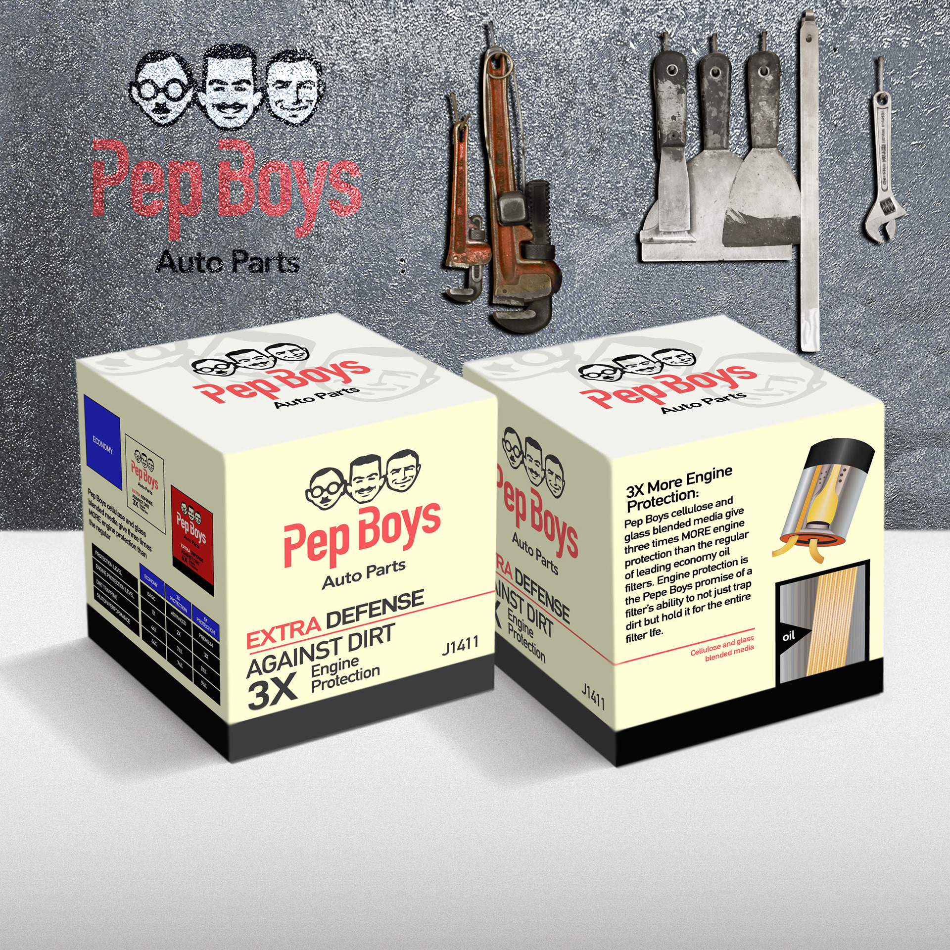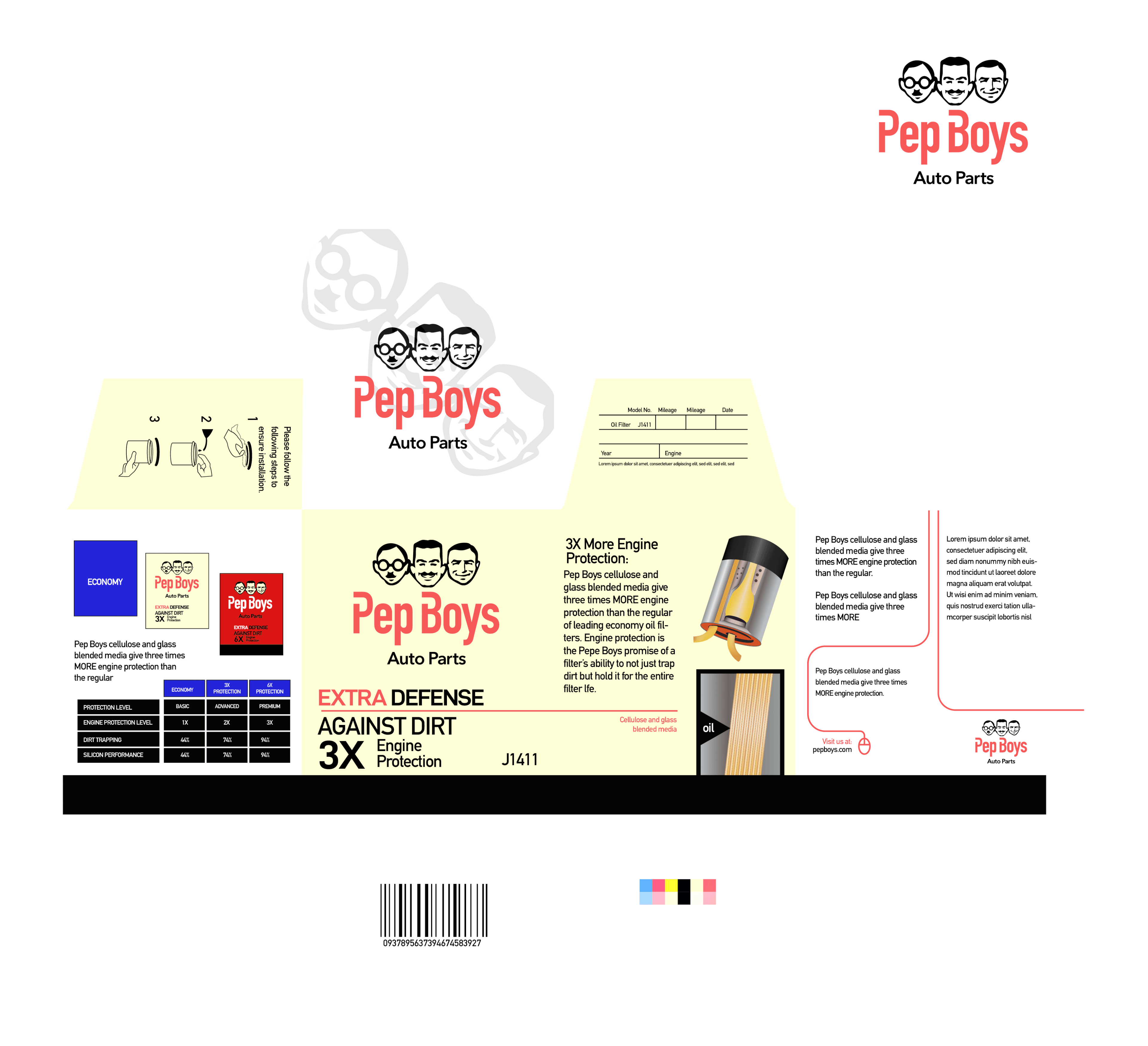
Pep Boys rebrandING
With this project I wanted to rebrand Pep Boys branding beginning with the logotype using open ended box wrenches as an inspiration for the cut outs with the stem of the letter "P" and bowl of the letter "B". I also wanted to hint back to the companies rich history with an off white/cream color giving it more vintage feel and contrasting it with the lighter of white on the top of the box.